

The Future We Were Promised
An analysis of frutiger aero and why it's so nostalgic (and sometimes even feels like a gut punch)

For those on my email list: this might be too long to read in full in email format. If so, you are able to read the full article on Substack.
Full disclaimer before I begin: the impetus for me writing this piece was a super entertaining and informative video essay on YouTube by Jonathan Carson. This video is really well researched and everything from how the term “frutiger aero” originated to the media closely associated with it is included in this analysis. Check it out!
A phrase commonly used online when folks see Frutiger Aero aesthetic images is “the future we were promised.” I’ve always wholeheartedly agreed with this sentiment without ever really considering why. But the more I thought about it while formulating this essay, the more it started to make sense. Frutiger aero promised us a future we didn’t get.
“Wait, hold on,” some of you might be saying right now. “What are you talking about? Frutiger aero? What does that even mean? How do you even say it?”
If you read my piece about microtrends and niche aesthetics online, you might remember how I specified what the term “aesthetic” means and how it often refers to a distinct design style. For example, if you walk into a room with bright colors, geometric patterns, and sculptural pieces, you might say the interior decorating has a postmodern aesthetic.
Frutiger aero (pronounced froo-tee-ger air-oh) is no different, except that it’s a web design aesthetic commonly seen in early 2000’s Windows products. If you watch Carson’s video up top, you’ll learn (like I recently did) that the name comes from a combination of “Aero,” the design language used in Windows Vista, and Adrian Frutiger, a Swiss type designer who created a typeface named after his surname. You’ve definitely seen this typeface before, you just might not have known its name:
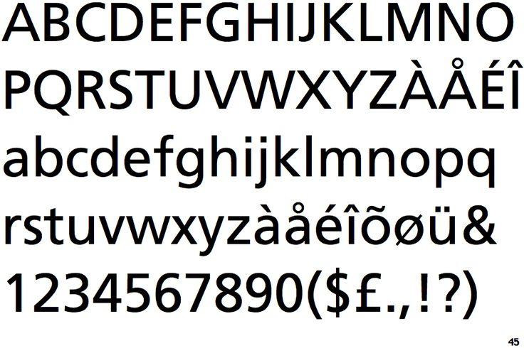
It’s basically like the sweeter, friendlier cousin of Helvetica or Arial.
Several visual motifs define this web design aesthetic including glossy textures, bubbles, glass, auroras, lens flares, and bright colors, often blue or green. “Skeuomorphism” also plays a big role; that’s the design approach where digital elements resemble real world objects (remember how the Safari app on early iPhones looked like an actual compass?).
You’ll also often find tropical fish, rolling green hills with distant skylines, and giant globes in these images too. If tech is present, like a laptop, it feels perfectly integrated, existing in harmony with the scene.


Everything from Microsoft sounds and Nintendo music to Softsoap bottles and those moving aquarium lamps fits under the aesthetic due to the fish imagery, soft blue glowing colors, and the almost pixie-dust-encrusted, dreamlike soundscape. Just listen to the Microsoft Windows 95 Startup Sound. It sounds like Tinkerbell granting you a wish.
In the past two years, the frutiger aero aesthetic has seen a massive resurgence as people reflect and reminisce. So much about it reminds young people of childhood. It’s not just visual, it’s deeply sensory. The aesthetic moves people so much that they’re hunting down old forms of “fun” tech like Wii games and DS consoles. I’ve even seen videos of people renovating their bedrooms or bathrooms to match the aesthetic and recreate the feeling their childhood spaces used to evoke.

 Tiktok failed to load.
Enable 3rd party cookies or use another browser
The frutiger aero aesthetic is often said to have been most relevant from 2004 to 2013, which make sense, since many of these images associated with it, often paired with the frutiger typeface, date back to the early Windows Vista era. I mean, I think most of us (at least those born early enough) probably remember when our lock screens and profile pictures looked like this when we powered on our large, surprisingly loud computers:


I think it’s worth looking closely at all these design elements, especially when you compare them to what our technology looks like today. Frutiger aero, as an aesthetic, faded away once Windows and Apple went for more streamlined, minimalist designs. The gloss and shine disappeared, the shadows behind the icons vanished, and remember how I mentioned skeuomorphism earlier? That left, too:


When finding the images above on Pinterest, I literally had a visceral reaction. I don’t think I ever consciously noticed the shift over time, but I do distinctly remember what these apps used to look like on my parents’ and grandparents’ phones. They were honestly kind of cute. I mean, look at the little tabs on the contact book! And the old TV with dials for the YouTube app?! Insane to think it ever looked like that.
There are plenty of people like me who love the frutiger aero aesthetic and find it deeply nostalgic. And when I hear folks online discuss why it’s nostalgic, it’s not surprising to me at all. I’ve heard things like the cooing of a morning dove associated with frutiger aero. A comment on a YouTube video essay about frutiger aero described the aesthetic as the morning before the last day of school when the sun is up, the air is crisp, and you’re waiting for the bus. It sounds oddly specific, but for someone like me who was born in the early 2000’s…it kind of make sense.
Frutiger aero rose to prominence during a time when tech itself was just beginning. For many of us, it marked the start of something new: technology becoming ever-present in our homes, phones that could easily fit in our pockets, and this shiny, new thing called the Internet. It was also a huge transitional moment for tech. I remember my parents getting flip phones and then over time watching them turn into smartphones. I remember using both DVDs and VHS tapes regularly. Old and new tech coexisted in this wonderful hodgepodge of past and present.
A lot of people remember this time clearly and how it was genuinely exciting. Nothing about this new technology felt harmful or scary. We were just thrilled because of new versions of Wii Sports or because we could play Solitaire on a computer screen. We called our friends on landlines to plan playdates and borrowed their cool, new iPads to play Minecraft.
In frutiger aero imagery, this moment in time is captured with optimism. Laptops float in the ocean alongside tropical fish. Skyscrapers stand peacefully next to lush fields. The tech always feels like it’s in harmony with everything around it. Nothing looks polluted, nothing feels jarring or artificial. It’s a vision of the future that’s bright, hopeful, and full of possibility.
This brings me back to the start of this essay: the phrase “the future we were promised.”
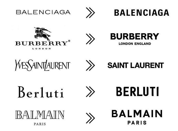
Obviously, the future of technology looks literally nothing like frutiger aero. That design aesthetic was ditched for something more streamlined and minimalist, hence the flat icons on our phones. And unfortunately, that shift didn’t just happen in tech. It happened everywhere. Don’t believe me? Just take a look at these fashion brands:
How about old Starbucks logo? Or McDonald’s exteriors? And if you’re anything like me, you remember with fondness what the interior of Panera Bread used to look like:


Streamlined minimalism has taken over so much of our design landscape in the past decade. With that means less detail, less color, and frankly, less joy. Sadly, we didn’t create vibrant, futuristic spaces that harmonize with nature like the images we see in frutiger aero. We just continued to obliterate the environment and build ugly-ass Cybertrucks (I will hate them until the end of time). I mean, seriously, how cool would it have been if our future actually looked like this?!


What’s most ironic to me is that while I was searching for that girl’s TikTok about her bathroom that I included above, I ended up scrolling through a bunch of frutiger aero-related videos. In the comments, Microsoft Edge’s account commented on a bunch of them saying things like “No literally” and “I wish” under TikToks where people were discussing how they wished the future looked like this. Microsoft Edge. You could have done this! You could have made this!
That’s what hurts the most when looking at these images. The reason frutiger aero sometimes feels like a gut punch is because this version of the future feels so out of reach. A sustainable, climate-friendly world where we’re are in sync with our technology and it doesn’t feel like something happening to us without our control. It was once the imagined dream, and supposedly, that’s what companies like Microsoft imagined too when creating this design aesthetic.
Maybe that’s why so many young people are returning to old forms of technology. They miss the time when it felt like we were in control of our technology, when it felt exciting and accessible and ours.
Ultimately, frutiger aero provides this strange dichotomy of past and future; it’s a longing for what once was with a yearning of what could have been.
And if writing this essay made me realize anything it was this: I’m definitely decorating my future kids’ bathroom like that.
Thank you so much for reading! This is definitely one of my favorite pieces I’ve written on Substack. By the way, this is the playlist I used while writing to get me in the frutiger aero mindset: nintendo frutiger aero chill mix. Some other songs that are closely related to frutiger aero that aren’t Nintendo (in case you’re interested) are “LEASE” by Takeshi Abo and “aquatic ambience” by Scizzie.
Hope you’re taking care of yourself! I appreciate you :)
- Lillian
THE SOAP BOTTLE!!! i can vividly remember this style from childhood!!!